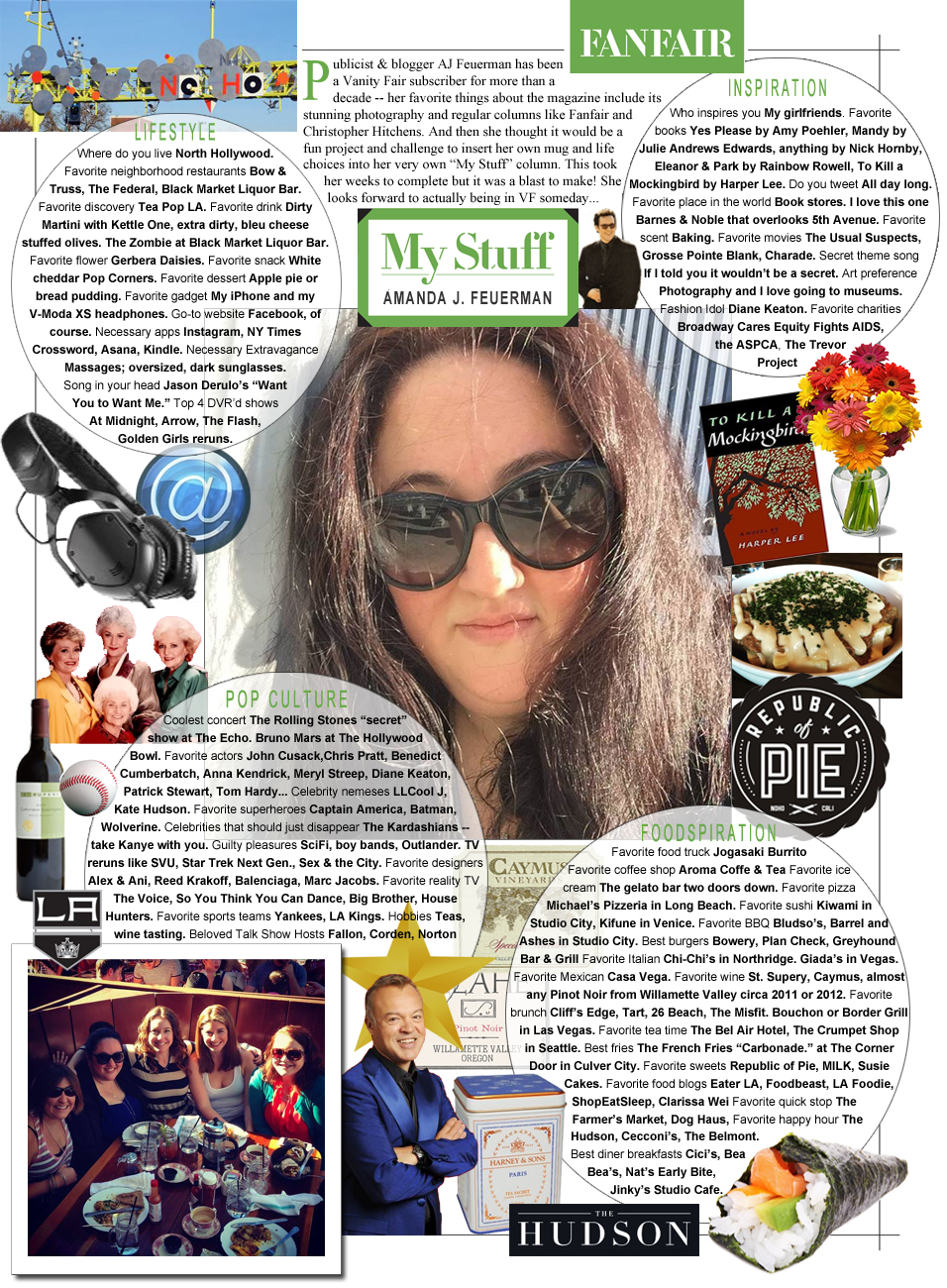
A graphic design/layout challenge I issued to myself that will only look familiar if you’ve ever read an issue or two of Vanity Fair. If not, to see the recurring feature this is based on, click here. (To enlarge the image below, simply click on it. Zoom in at will.)
This has basically been an exercise in vanity — but if you’re ever going to be vain, it may as well be for such an aptly named magazine. Fun facts — Vanity Fair was established in 1913 but was folded into Vogue in 1935 following the Great Depression. It wasn’t resurrected and built into the publication we know today until 1981. They also have a fabulous app. Their photography sure looks fantastic in digital but I’m still clinging to “the book” (pro tip: in the entertainment industry, we refer to the print edition of a publication as “the book”).


I hate Vanity Fair but I do like your graphic! It makes factoids and trivia more fun and appealing! Great job!